iDoctor
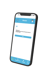
iDoctor was created to streamline the check-in process, eliminating the need for people to spend time waiting at the reception and reducing unnecessary paper work. The app not only facilitates check-ins at the family doctor's office but also enables patients to respond to initial questions and securely store their answers in the system. This ensures that the doctor has access to the information at the beginning of the consultation.
.png)
My role:
UI/UX Designer
Duration:
3 weeks
The problem
In a fast-paced society, individuals prefer not to spend time queuing at clinics for check-ins or answering general questions. Furthermore, standing in queues at doctor's offices increases the risk of contact with potentially infected individuals.
Main goals:
Design an app and website for iDoctor that allows patients to reduce time in the queue at clinics. The platform also protects patients from potential sick people.
User Research
Initially, I defined the users as patients. Then, I continued the empathize phase through user research to understand their behavior, needs, and motivations.
I conducted extensive research on the apps and websites already existing in the market, performing a competitive analysis to gain knowledge of the market.
Finally, I interviewed 5 people aged between 20 and 65 to understand the problems they encounter when seeking medical care at a clinic.
Out of the 5 people interviewed, 4 mentioned wasting a significant amount of time during the pre-service phase, and 3 expressed concerns about having contact with infected people at the reception.


User Pain Points
Time - Users spend too much time waiting in queues at the front desk of their family doctors.
Protection - The more time patients spend at reception, having contact with other people and sharing objects such as pens, papers, etc., the greater the chance of having contact with sick and infected people.
Ease of use - To cancel their appointments, users have to call the doctor's office or send an email, and they are not sure whether the cancellation is confirmed.
User Personas


User Journey Map

User Flow

UI Design Style Guide
_edited.png)
Low Fidelity Wireframes

High Fidelity Wireframes
Final Design
Splash Screen


Learnings from this project
A major learning experience was how to conduct research, interviews, and usability tests.
Also, through this project, I was able to practice all phases of the design process, from initial research to the final project.
See prototype
Thanks for reading!
I appreciate that you tuned in till here!!